Georgia O'Keeffe - Radiator building
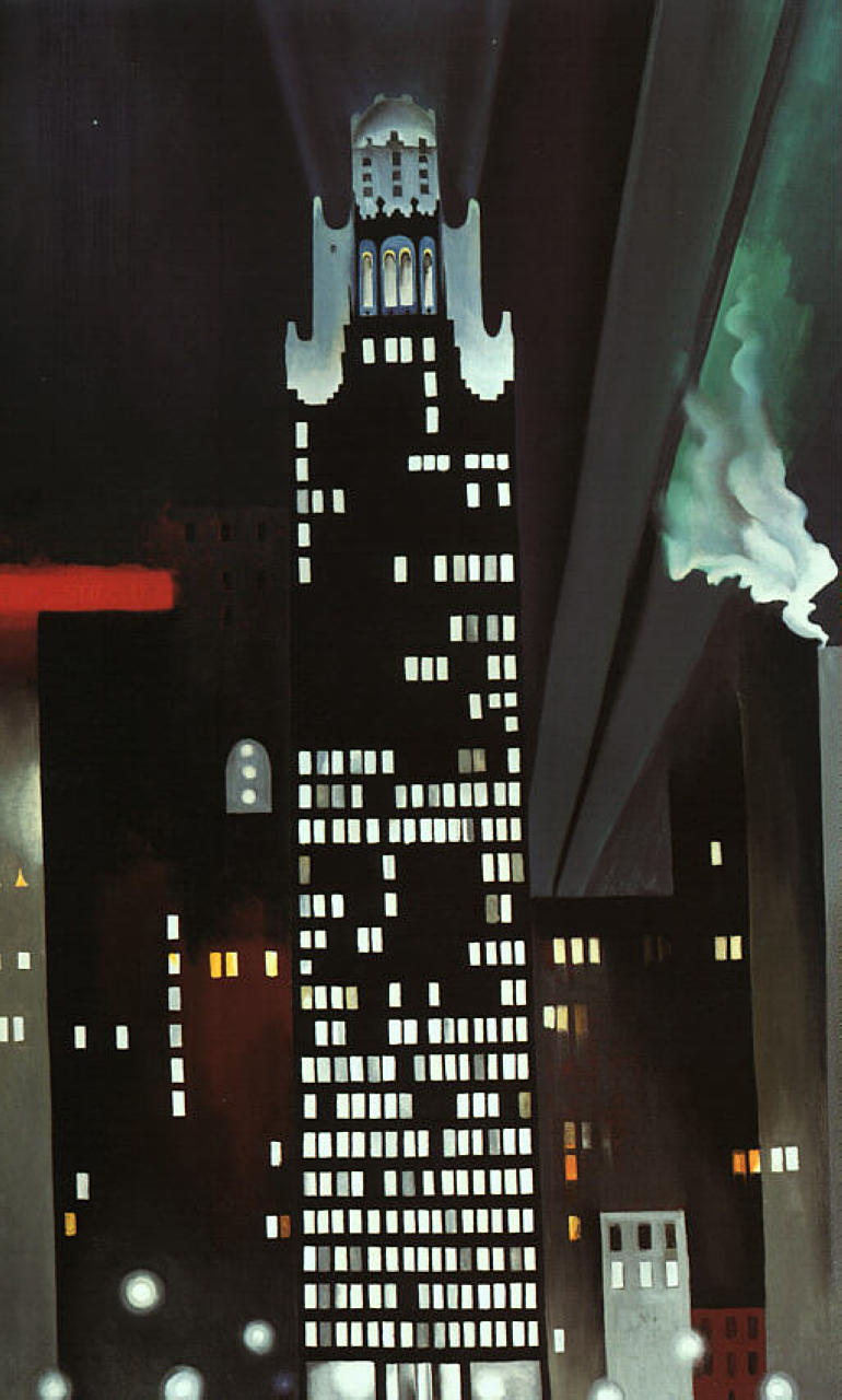
This is a painting by O'Keeffe which is very art deco style, her work is very interesting especially with the contrasts of that between the dark building which blends into the dark blue background but still distinguishable and that of the white windows of the building.

Her other work also takes the style of art deco, she mainly paints flowers or buildings and uses quite a linear style.
Jenny Holtzer


Jenny Holtzer is an artist whom projects sentences over buildings usually in a political or philosophical ways and photographs the outcome, usually in black and white which allows the text to stand out more with the backgrounds and this allows the audiences eyes to focus on the message.
Katherina Grosse
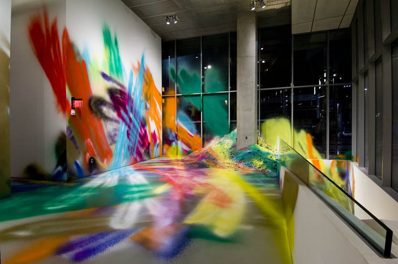

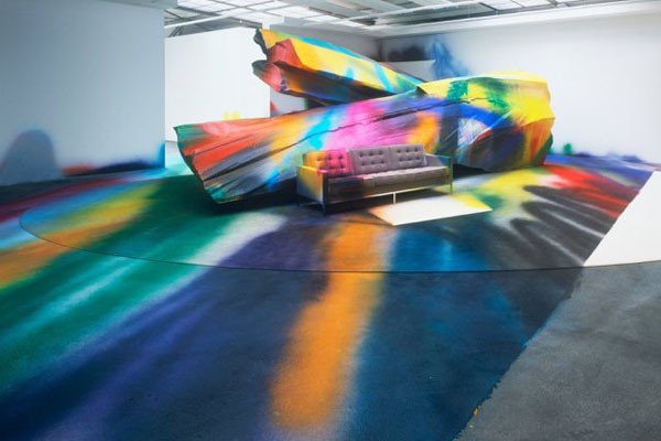
Katherina Grosse treats the insides of buildings, such as staircases, flooring and walls as canvases that she paints with spray paint and the result is very vibrant and colourful designs that are very eye catching that clashes with its environment.
Leo Verhoeven
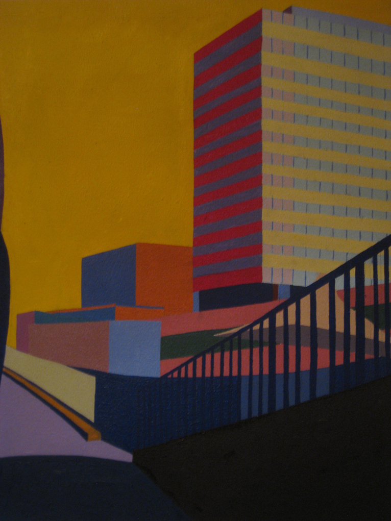


Leo Verhoeven paints urban landscapes in a very abstract way with use of straight shapes and monotone colours, the simplicity and repetitiveness of his art is surprisingly detailed for what is actually being shown and even with the wrong use of colour being used on different things it is still easy to see what is what.
Katherine Lubar - Falling up the stairs

This piece of art work is composed of just two colours, white and a deep red and is painted in a very abstract and art deco pattern composed of straight lines and using angles to get an accurate portrayal of how the shadows are shown on the stairs.


Other work by her has the same style, with the basic outline of the shapes and monotone colours used to fill them, this leaves the objects outline to be the main visual attraction, allowing you to take in the work easier and enjoy how the colours co-operate and clash with each other.
Patrick Cornee


Patrick Cornee uses very bright colours which contrasts with the darkness of the shadows and is an interesting artist due to how he puts his own abstract twists of the shapes of the things he paints but not in such a way that it looks much different than usual. He manages to make his work look quite gothic and eery in certain aspects due to the crookedness and twisting movements he gives his objects.
No comments:
Post a Comment