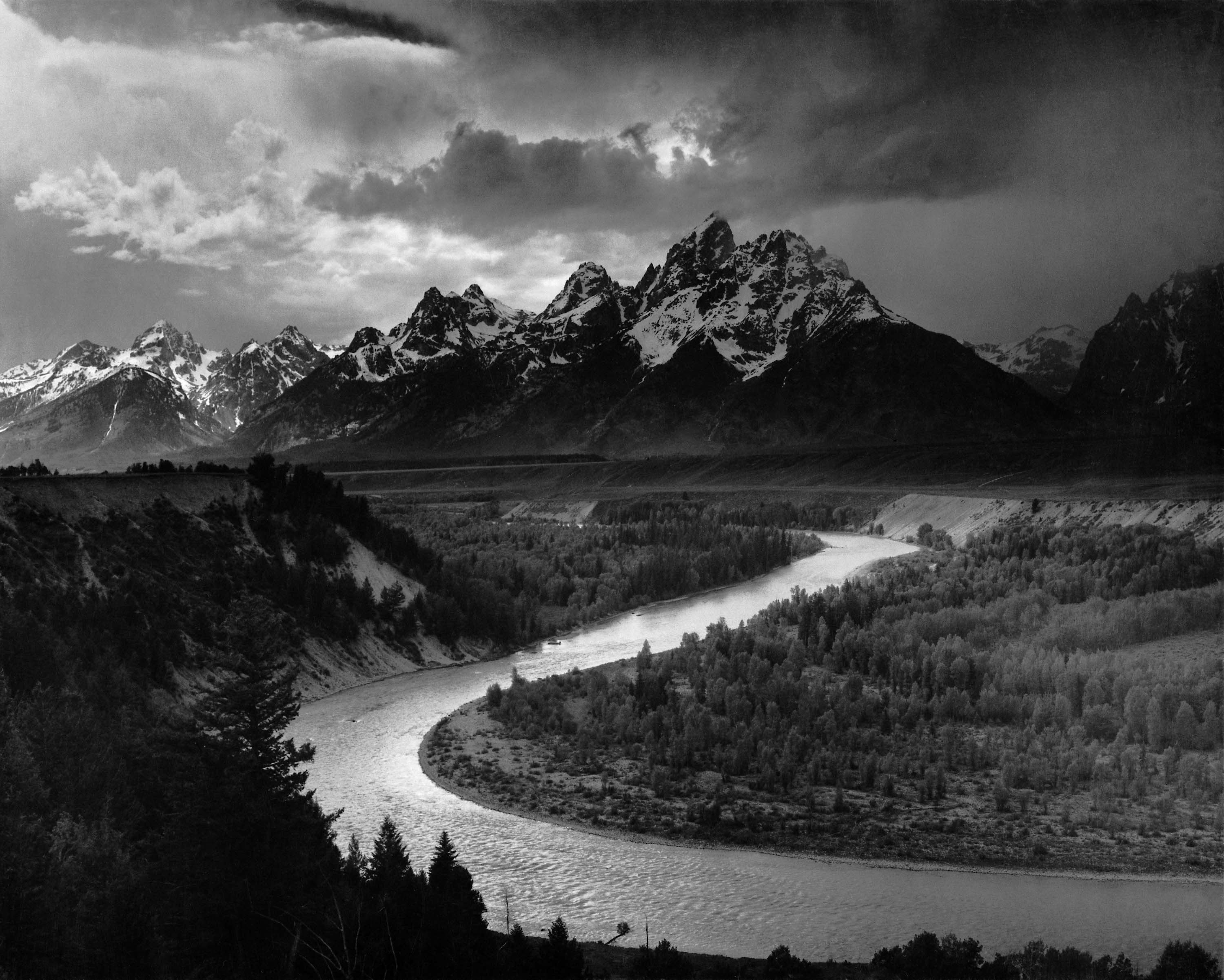


Ansell Adams explores american locations and uses a slow shutter speed to capture more movement among the clouds and water in lakes, he is also a great photographer and has an amazing eye at capturing good depth of field and positioning his shots, his photographs include a lot of power and detail from the amazing views that he represents through the digital images.
Steve Greaves
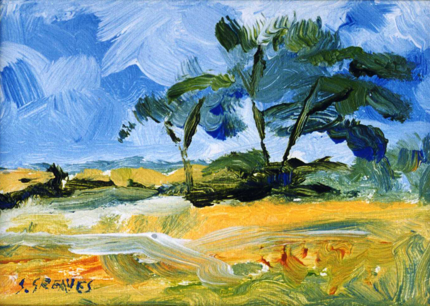
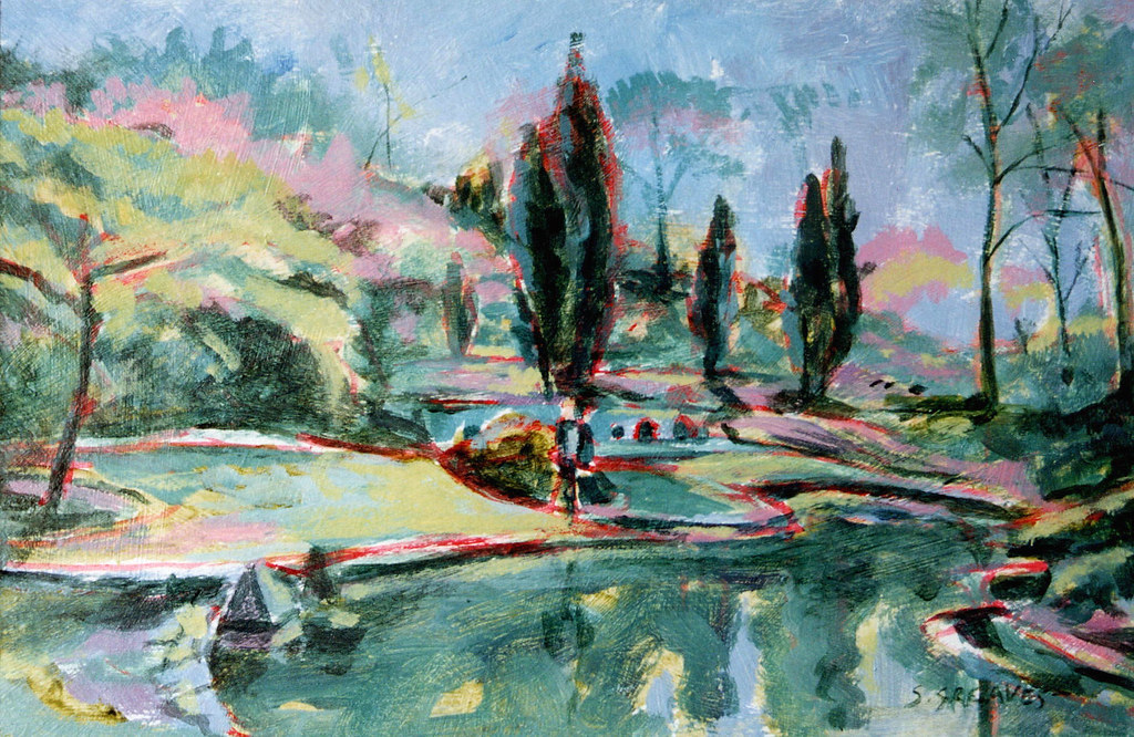
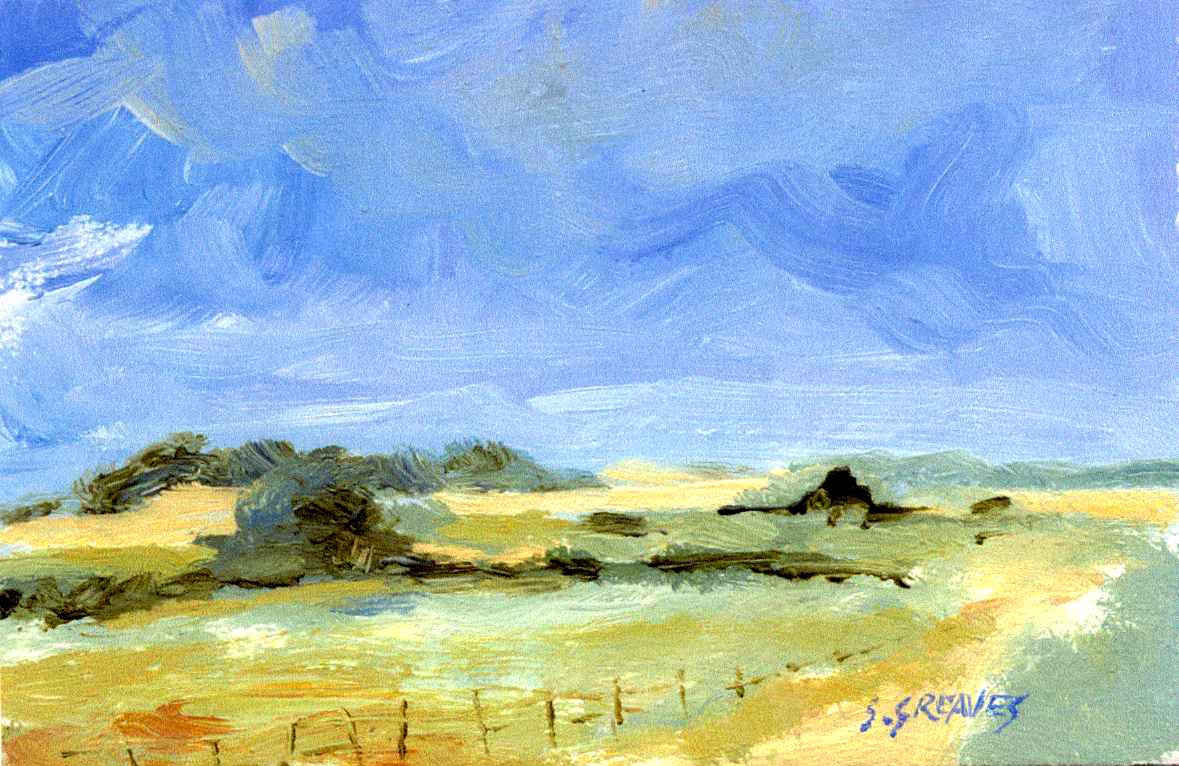
Steve Greaves uses quick brush strokes and barely goes over and blends his paint allowing his art to look quite abstract but still clear as to what it is, I find his best work to be those with a blue colour scheme with outlines of red spread around some of the hills and trees that give it an edge and makes it much more aesthetically pleasing due to the contrast.
Peter Lancaster


Peter Lancaster uses water colours to paint landscapes which include water as he paints whilst fishing, I find that a lot of his paintings have parts which are painted in a lot of detail and other parts seem quite monotone and bland in comparison, this allows the audience to maintain its attention on more parts than others , his use of reflection and shadows I find to be very good also on his work.
Rafal Olbinski
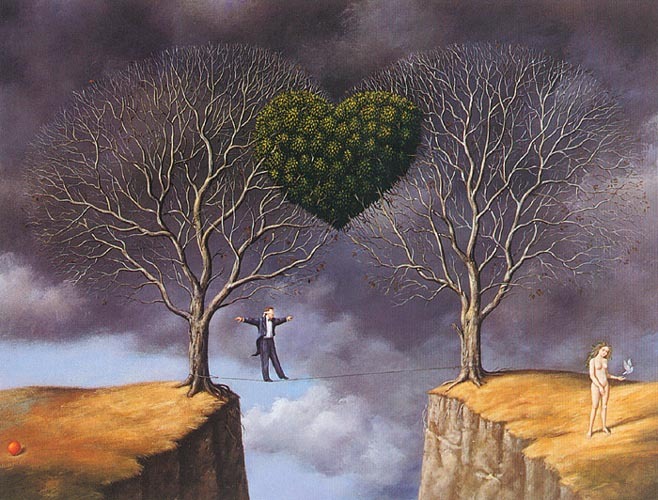

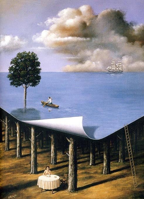
Rafal Oblinski entwines both landscapes and dream like thoughts in his work, often making it so that models are affecting the landscape and making it fit to their needs rather than accepting it for what it is, my favourite piece of his works involves a dead forest with a woman who had climbed a ladder and changed the scenery to that of an ocean with a singular tree in it, this surrealism is very intriguing to what it could signify and what aim the woman had and what she could be thinking about, and I find work that is thought provoking to be more interesting to view.
Katherine Norris


Katherine Norris is an landscape artist whom uses quite dark and pale colours as a base colour and then layers slabs of bright colours in contrast as the leaves and parts of grass which makes her paintings look divided between and attracts the audiences gaze at only specific parts of the work.
Cathy Horvath
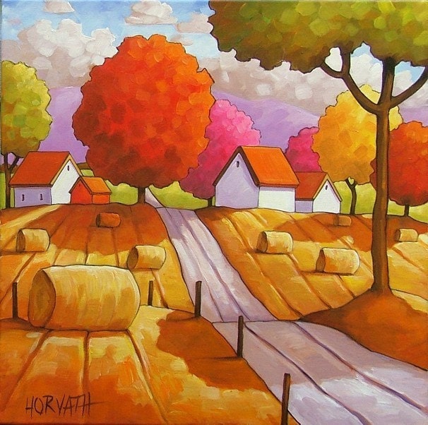
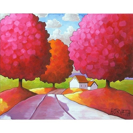

Cathy Horvath uses natural colours however uses extreme versions of them making them stand out and add a lot of vibrance and light to her art. My favourite parts of her art work is when she paints water and uses the reflection of clouds over the surface as it reminds me of old Japanese artwork which is done on paper and outlined with a simple yet effective appearance.
No comments:
Post a Comment