Wednesday, 26 November 2014

6 self potrait artists

Kathy Kolwitz


Kathy Kolwitz is an artist who mainly works with graphite and charcoal pencils and does self portraits of herself portrayed differently, Kolwitz is a jewish woman whom survived world war two and the holocaust and a lot of her work portrays some raw emotion which she had felt throughout that stage in her life.

Phillip Guston


Phillip Guston is an artist whom paints himself in surreal ways, his work signifies his addiction to alcohol which he has had since a young age and what it was like for him to get over it, I like the way in which he paints quite comically but this however contrasts the seriousness in which it affected his life.

Ken Kiff


Ken Kiff is a figurative artist and was brought up when abstract art was becoming a big thing, so this influenced him a lot, resulting in his paintings and other art work to look almost dream like and like that of a child's fantasy tale.

Guy Denning


Guy Denning is an self portrait artist whom uses mediums of paint, charcoal , pencils and collage within his work. Denning is one of my favourite artists due to how with only a few powerful lines amongst some smudged colours he can effectively grasp the figures emotions and gives a huge amount of detail.

Bryan Lewis Saunders


Bryan Lewis Saunders is an experimental artist and he set out to give himself unique factors whilst painting unlike other artists, for his self portrait series of work he gave himself multiple drugs, each painting he is under the effect of something different, this series of work I found to be extremely amazing due to all the different styles he achieved. Showing that artists may perceive things differently depending on the way they feel and the chemicals in their brain.

Francis Bacon


Francis Bacon is an artist whom manages to show a lot of raw power and emotion with his paintings, often isolating his figures in cage like shapes and using dark colours, he became renowned as one of the most influential dark and gothic artists. His self portrait of himself shows his face to be twisted, perhaps signifying that he sees the world in a different way from others, at the time bacon was a closeted homosexual so this might have had some relevance.

6 landscape artists

Ansell Adams


Ansell Adams explores american locations and uses a slow shutter speed to capture more movement among the clouds and water in lakes, he is also a great photographer and has an amazing eye at capturing good depth of field and positioning his shots, his photographs include a lot of power and detail from the amazing views that he represents through the digital images.

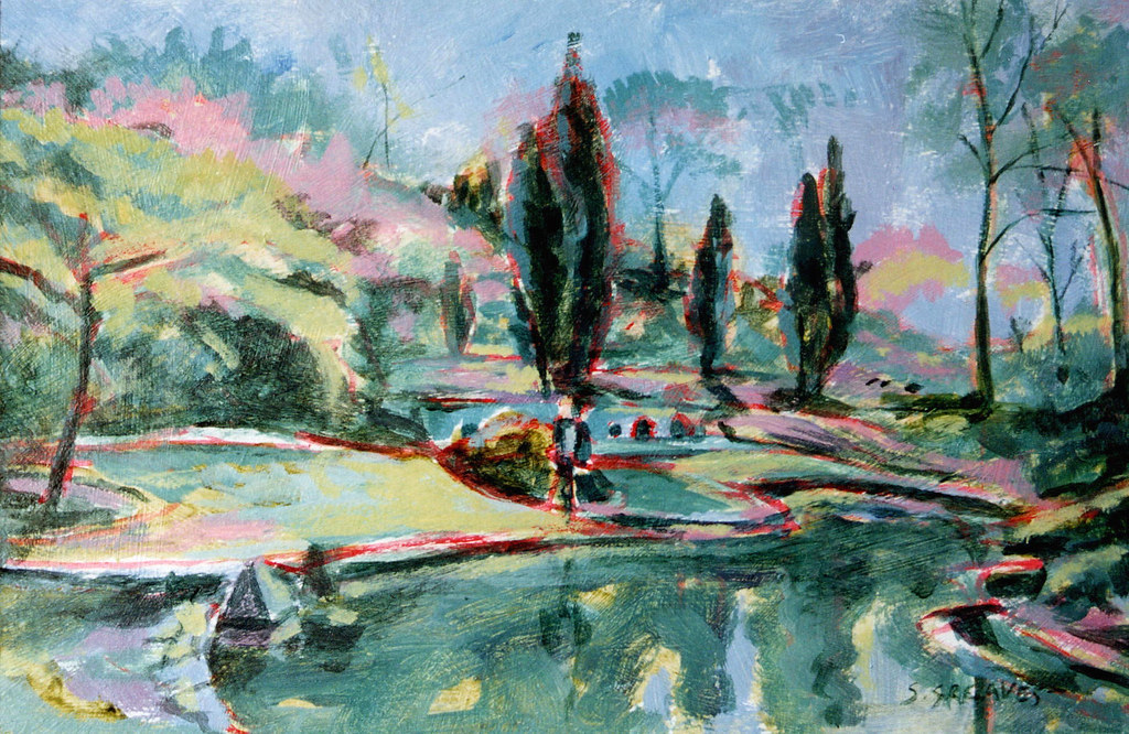
Steve Greaves


Steve Greaves uses quick brush strokes and barely goes over and blends his paint allowing his art to look quite abstract but still clear as to what it is, I find his best work to be those with a blue colour scheme with outlines of red spread around some of the hills and trees that give it an edge and makes it much more aesthetically pleasing due to the contrast.


Peter Lancaster


Peter Lancaster uses water colours to paint landscapes which include water as he paints whilst fishing, I find that a lot of his paintings have parts which are painted in a lot of detail and other parts seem quite monotone and bland in comparison, this allows the audience to maintain its attention on more parts than others , his use of reflection and shadows I find to be very good also on his work.

Rafal Olbinski


Rafal Oblinski entwines both landscapes and dream like thoughts in his work, often making it so that models are affecting the landscape and making it fit to their needs rather than accepting it for what it is, my favourite piece of his works involves a dead forest with a woman who had climbed a ladder and changed the scenery to that of an ocean with a singular tree in it, this surrealism is very intriguing to what it could signify and what aim the woman had and what she could be thinking about, and I find work that is thought provoking to be more interesting to view.

Katherine Norris


Katherine Norris is an landscape artist whom uses quite dark and pale colours as a base colour and then layers slabs of bright colours in contrast as the leaves and parts of grass which makes her paintings look divided between and attracts the audiences gaze at only specific parts of the work.

Cathy Horvath


Cathy Horvath uses natural colours however uses extreme versions of them making them stand out and add a lot of vibrance and light to her art. My favourite parts of her art work is when she paints water and uses the reflection of clouds over the surface as it reminds me of old Japanese artwork which is done on paper and outlined with a simple yet effective appearance.

6 Urban land scape artists

Six urban landscape artists whom caught my interest were Georgia O'Keeffe, Jenny Holtzer, Katherina Grosse, Leo Verhoeven, Katherine Lubar and Patrick Cornee.

Georgia O'Keeffe - Radiator building


This is a painting by O'Keeffe which is very art deco style, her work is very interesting especially with the contrasts of that between the dark building which blends into the dark blue background but still distinguishable and that of the white windows of the building.


Her other work also takes the style of art deco, she mainly paints flowers or buildings and uses quite a linear style.

Jenny Holtzer


Jenny Holtzer is an artist whom projects sentences over buildings usually in a political or philosophical ways and photographs the outcome, usually in black and white which allows the text to stand out more with the backgrounds and this allows the audiences eyes to focus on the message.

Katherina Grosse


Katherina Grosse treats the insides of buildings, such as staircases, flooring and walls as canvases that she paints with spray paint and the result is very vibrant and colourful designs that are very eye catching that clashes with its environment.

Leo Verhoeven


Leo Verhoeven paints urban landscapes in a very abstract way with use of straight shapes and monotone colours, the simplicity and repetitiveness of his art is surprisingly detailed for what is actually being shown and even with the wrong use of colour being used on different things it is still easy to see what is what.

Katherine Lubar - Falling up the stairs


This piece of art work is composed of just two colours, white and a deep red and is painted in a very abstract and art deco pattern composed of straight lines and using angles to get an accurate portrayal of how the shadows are shown on the stairs.


Other work by her has the same style, with the basic outline of the shapes and monotone colours used to fill them, this leaves the objects outline to be the main visual attraction, allowing you to take in the work easier and enjoy how the colours co-operate and clash with each other.

Patrick Cornee


Patrick Cornee uses very bright colours which contrasts with the darkness of the shadows and is an interesting artist due to how he puts his own abstract twists of the shapes of the things he paints but not in such a way that it looks much different than usual. He manages to make his work look quite gothic and eery in certain aspects due to the crookedness and twisting movements he gives his objects.